When we think of children’s books, one of the first things that comes to mind is color—bright reds, soft pastels, deep blues, and everything in between. But color in picture books isn’t just for decoration. It can shape the mood, guide attention, and even influence how young readers feel about a character or scene.
Welcome to the world of color psychology, a powerful tool in the hands of authors and illustrators.
Let’s explore how you can use color intentionally to add emotional depth and storytelling magic to your books.
Why Color Matters to Kids
Children are incredibly responsive to visual cues—especially color. Before they can read words, they “read” images, and color is often the loudest part of that visual language.
Here’s why it’s so powerful:
- Color helps set the emotional tone. Is the scene cozy, scary, exciting, or calm? Color helps show that, even without text.
- It draws attention. A splash of red or yellow can pull a child’s eye to a key detail.
- It supports memory. Colors make moments more memorable. Think of how clearly we remember the golden slippers in a fairy tale, or a green monster in a closet.
What Different Colors Can Say
Every color has its own emotional language. Here are a few quick examples:
- Red: Energy, excitement, danger, or strong emotion. Use sparingly to make something stand out or feel intense.
- Blue: Calm, trust, sadness, or nighttime. It can help settle the mood or suggest quiet reflection.
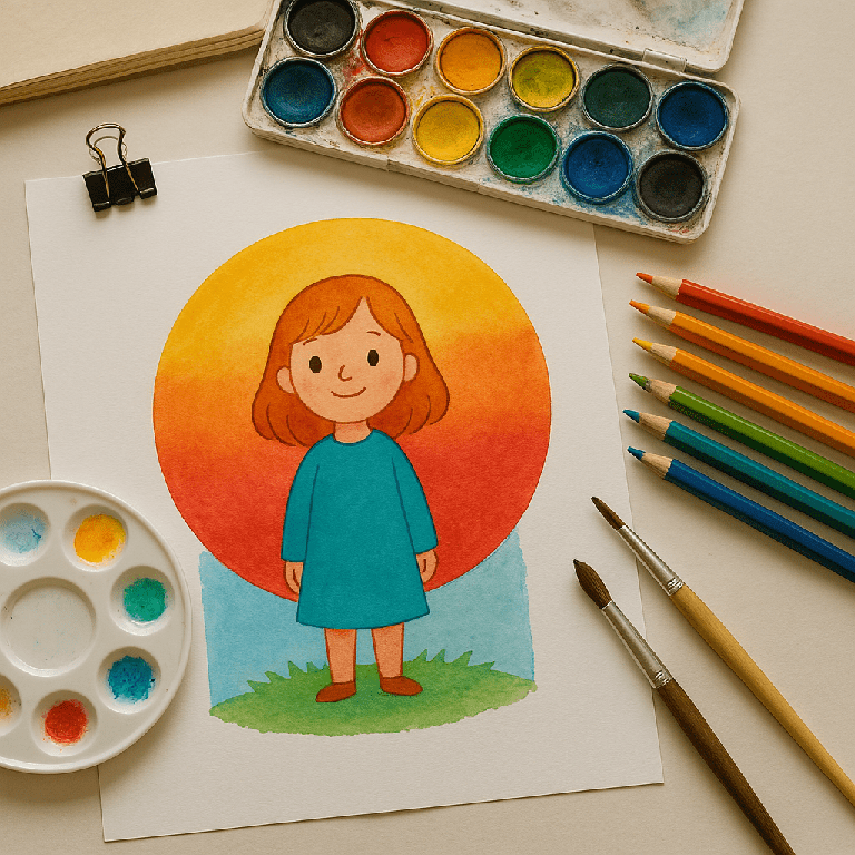
- Yellow: Happiness, curiosity, warmth. Great for sunny scenes or cheerful characters.
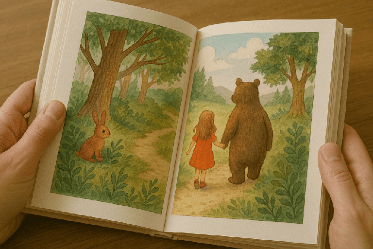
- Green: Nature, growth, balance. It often symbolizes new beginnings or peaceful settings.
- Purple: Imagination, magic, mystery. A favorite for whimsical or enchanted tales.
- Pink: Gentleness, kindness, love. Often used for warmth and affection—but don’t limit it to stereotypical uses.
- Black & Gray: Shadows, fear, sadness, or seriousness. These shades can create contrast or heighten emotional scenes.
Of course, these meanings can vary by culture or personal experience—but they offer a strong starting point.
Matching Color to Mood
Think about the emotional journey of your story. Is there a moment of joy? A conflict? A quiet reflection? The color palette can evolve to reflect that journey.
For example:
- A story that starts with a lonely gray world might slowly brighten with soft blues and greens as the character finds friendship.
- A chaotic scene might use bold primary colors, while a calm bedtime moment might favor muted purples and soft blues.
Color can support the arc of the story in the same way words do.
Designing Characters With Color in Mind
Characters themselves can have signature colors that reflect their personalities:
- A brave, adventurous child might be dressed in red or orange.
- A wise owl character could be surrounded by cool, thoughtful blues.
- A shy creature might live in a soft, pale environment—but burst into color as they grow confident.
Even the backgrounds and props can reflect a character’s internal world.
Tips for Writers (Even If You’re Not the Illustrator)
Even if you’re not doing the illustrations yourself, you can:
- Include color notes in your manuscript to suggest mood or emphasis.
- Think about how color could change from scene to scene.
- Talk with your illustrator about the emotional beats in your story and how color can support them.
Remember: You don’t need to micromanage—just offer insight into the feeling you’re aiming for.